
Opening the doors as wide as possible
Het Concertgebouw is more than just a venue—it’s a cultural icon with a rich history and an undisputed reputation in classical music. But staying relevant means continuing to amaze new audiences while respecting the traditions that loyal visitors cherish.
Our mission? Refresh the brand identity to make it more vibrant, versatile, and welcoming—a tangible step forward that embraces a broader audience while maintaining the grandeur of this world-renowned institution.


Brand evolution, not revolution
To move with the times, we carefully refined the iconic lyre instrument—inspired by the golden rooftop ornament—giving it a simpler, more geometric form that functions as a primary asset in communication.
Additional refinements included:
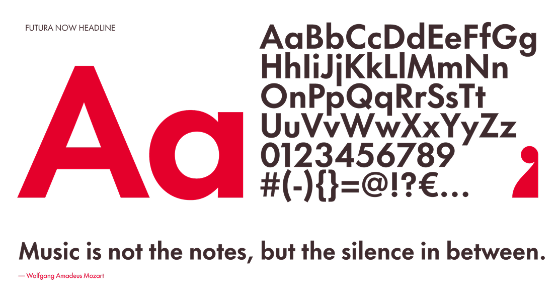
-A refreshed, digital-friendly color palette, still anchored by the signature house red.
-More flexibility in color combinations, making the system more practical and expressive.
-A modernized layout grid, balancing structure with creative freedom.
The result? A bold yet elegant visual identity that preserves the legacy of Het Concertgebouw.


Turning up the excitement factor
The layout grid is instantly recognizable and versatile, giving a frame to the diverse range of artists who perform at Het Concertgebouw.
A much-loved historic institution, now with a lively fresh face—one that welcomes all music lovers with open arms.


A flexible brand identity for every need
Looking for a brand refresh that honors the past but prepares you for the future?
Send a mail to mark@welcometocircus.com
Work
Collaborators
Zicht Online - UI/UX Design & Development

