A new lease of life
The Royal Concertgebouw has always distinguished itself with easily recognizable visual identities. So when the renowned institute asked us to freshen up their existing identity, we naturally said yes. An evolution, not a revolution, keep what works but introduce some flexibility that could accommodate the hall’s impressive spectrum of genres and events.
Services
Place branding
Visual identity
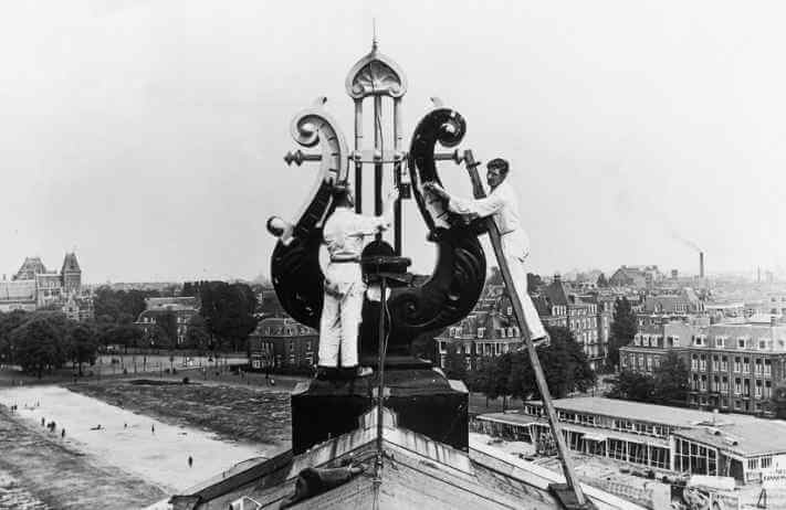
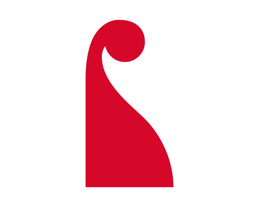
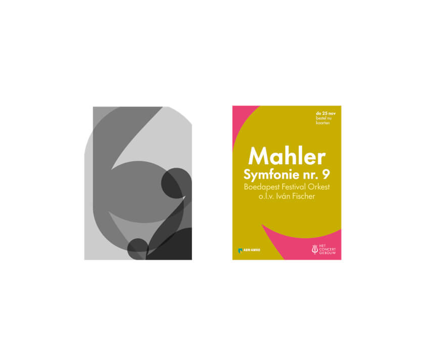
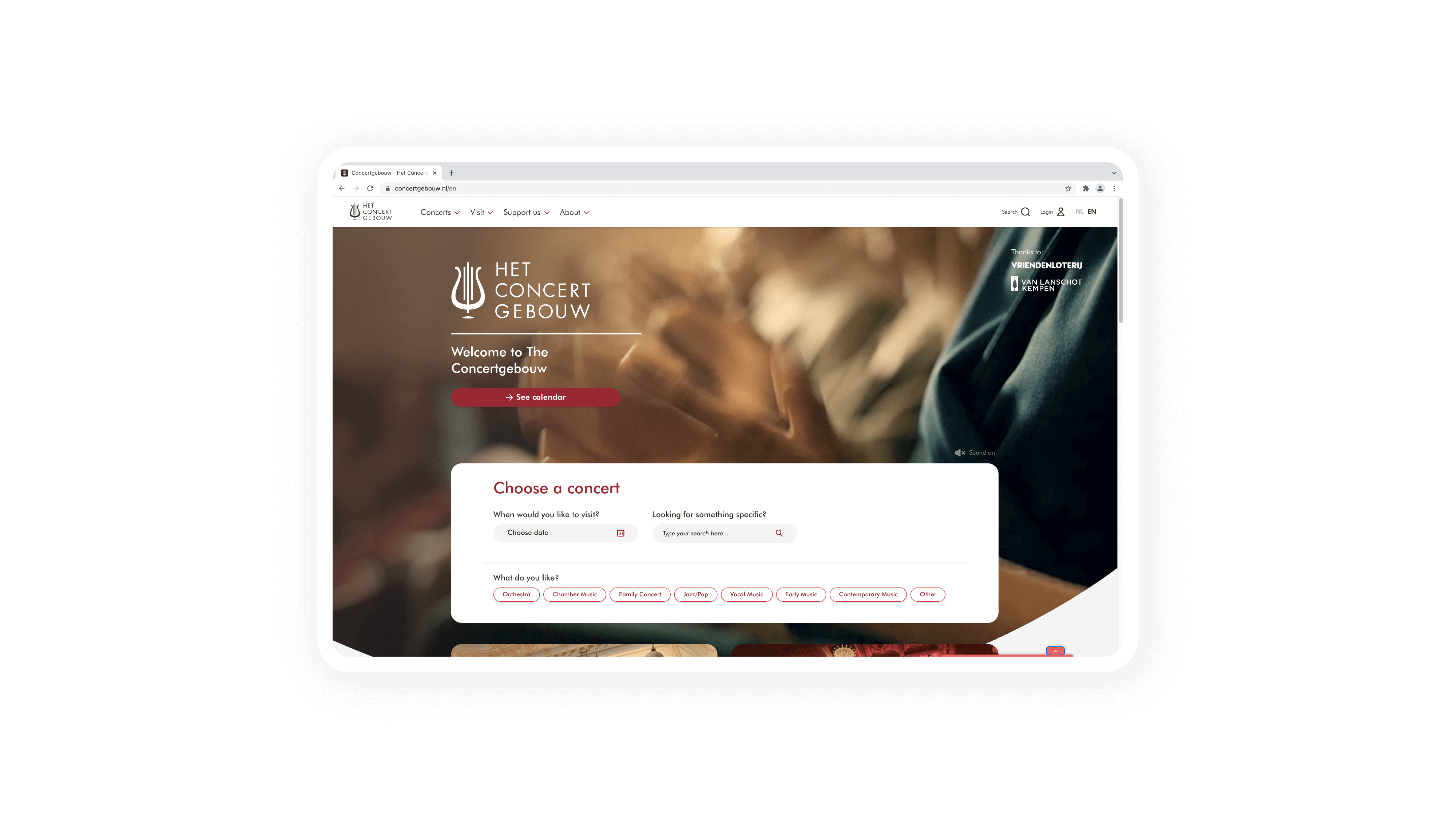
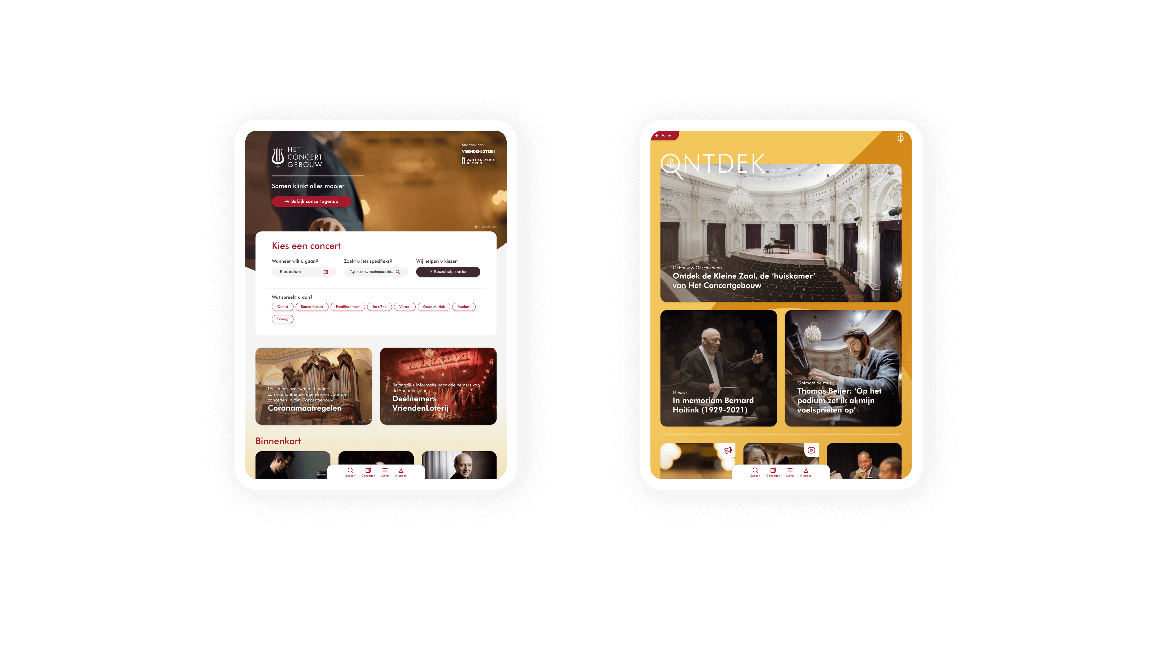
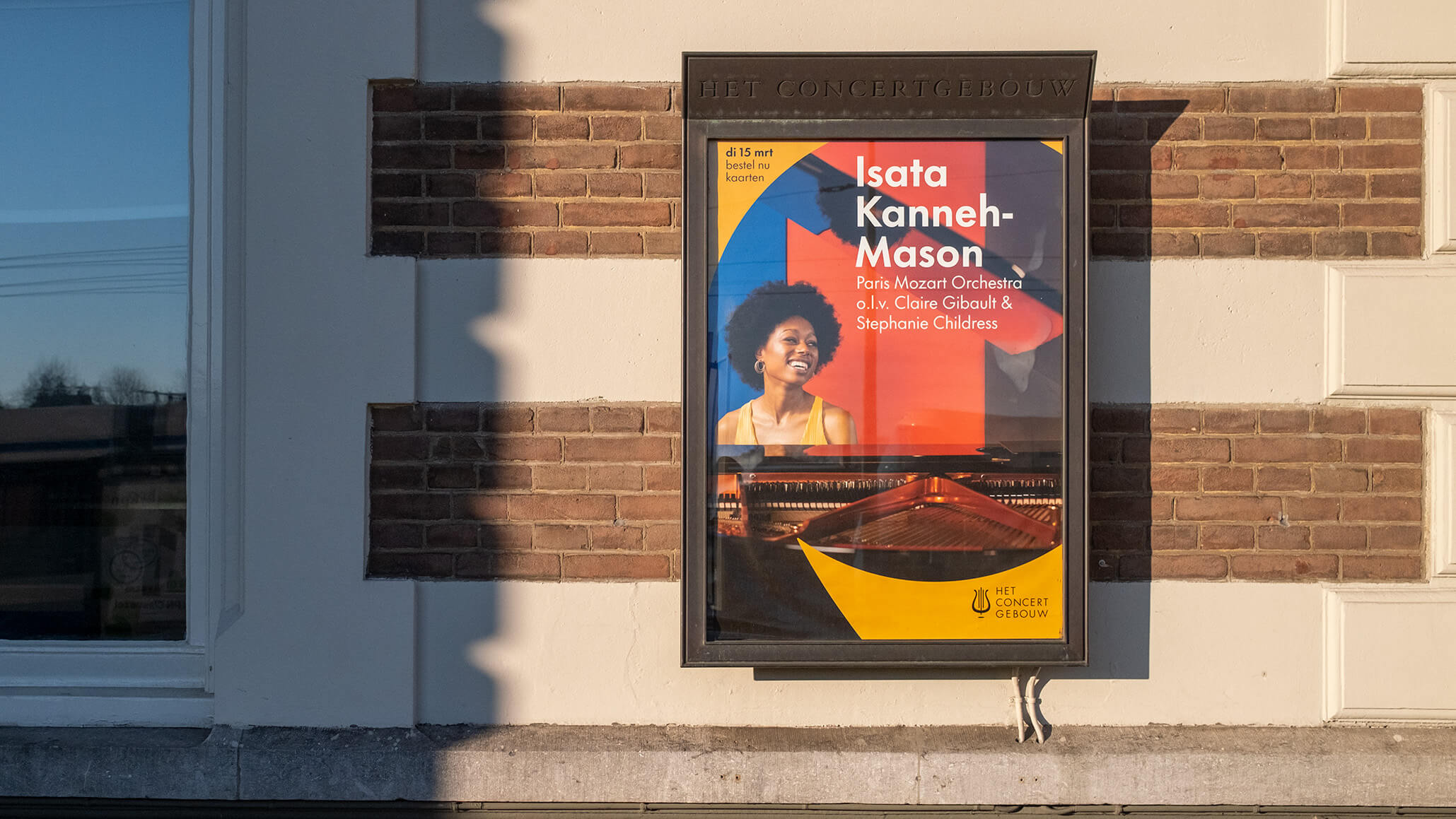
Redefining an icon
At the heart of our visual identity is a lire-shaped system. This iconic medieval instrument has always been unique to The Royal Concertgebouw, both inside and on top of the hall. We transformed the lire into a more contemporary icon which, while still recognizable, brings with it a playful and flexible design system that allows for unlimited variations.
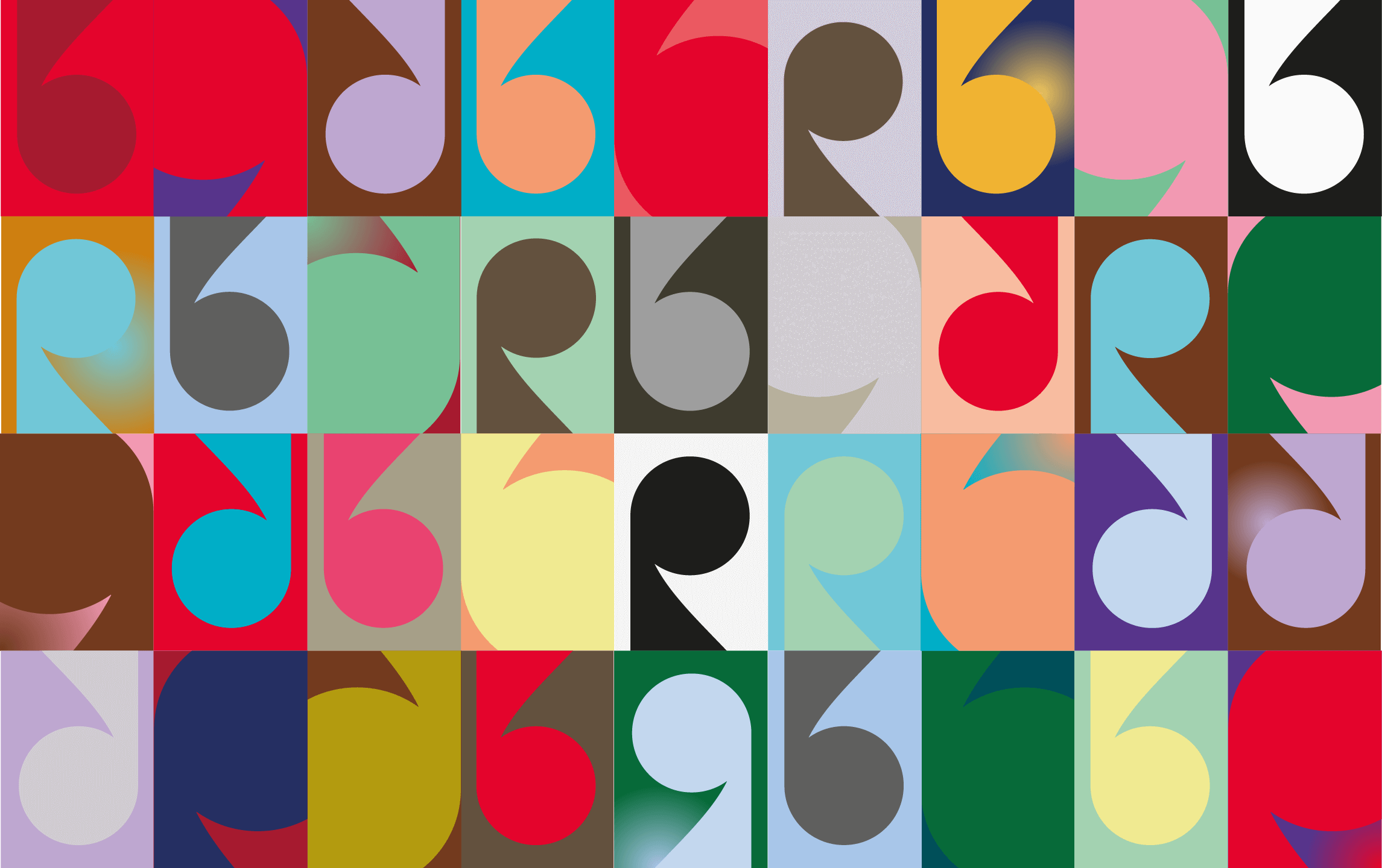
Less rules, more flexibility
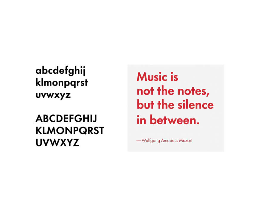
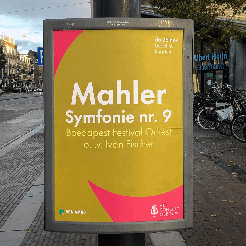
While retaining the Concertgebouw’s recognizable red, we introduced a more vibrant color palette and introduced a system that allows for more freedom in mixing and matching. Less rules, more flexibility. We complimented the new graphic design system with more accessible typesetting and refined photography principles, giving the Royal Concertgebouw a new suite of possibilities to let their star shine.